UI Component Library
A complete design system and component library for your product or platform. Built in Figma, documented for both designers and developers.
What this covers.
If you have a digital product, an internal tool, or a platform that multiple people design and build for, working without a component library means every designer and developer is making slightly different decisions. The result is visual inconsistency that compounds over time: buttons that look subtly different, spacing that varies between sections, form elements that are not quite the same across features. None of these individually are catastrophic. Collectively, they degrade the quality and professional feel of the product.
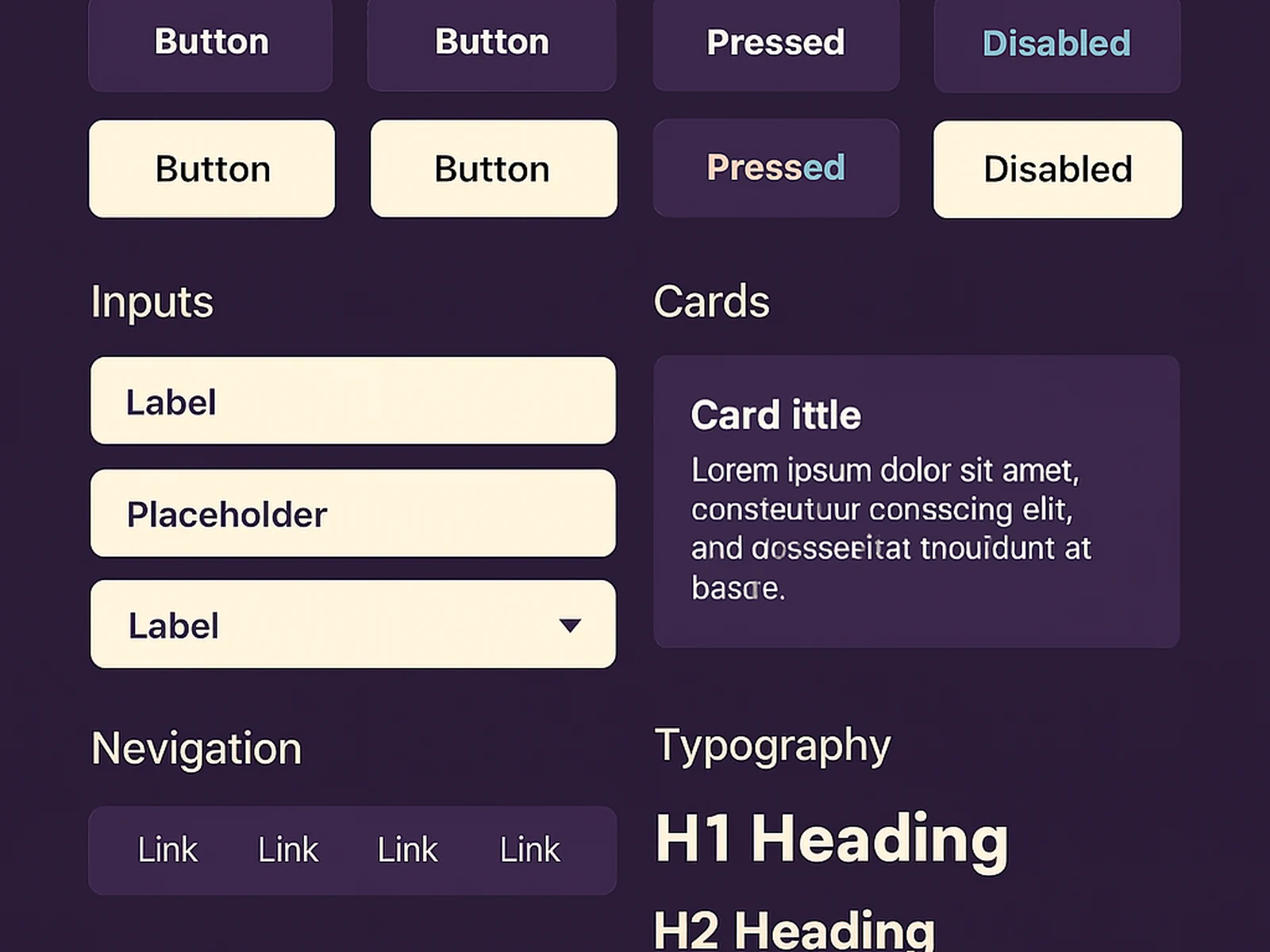
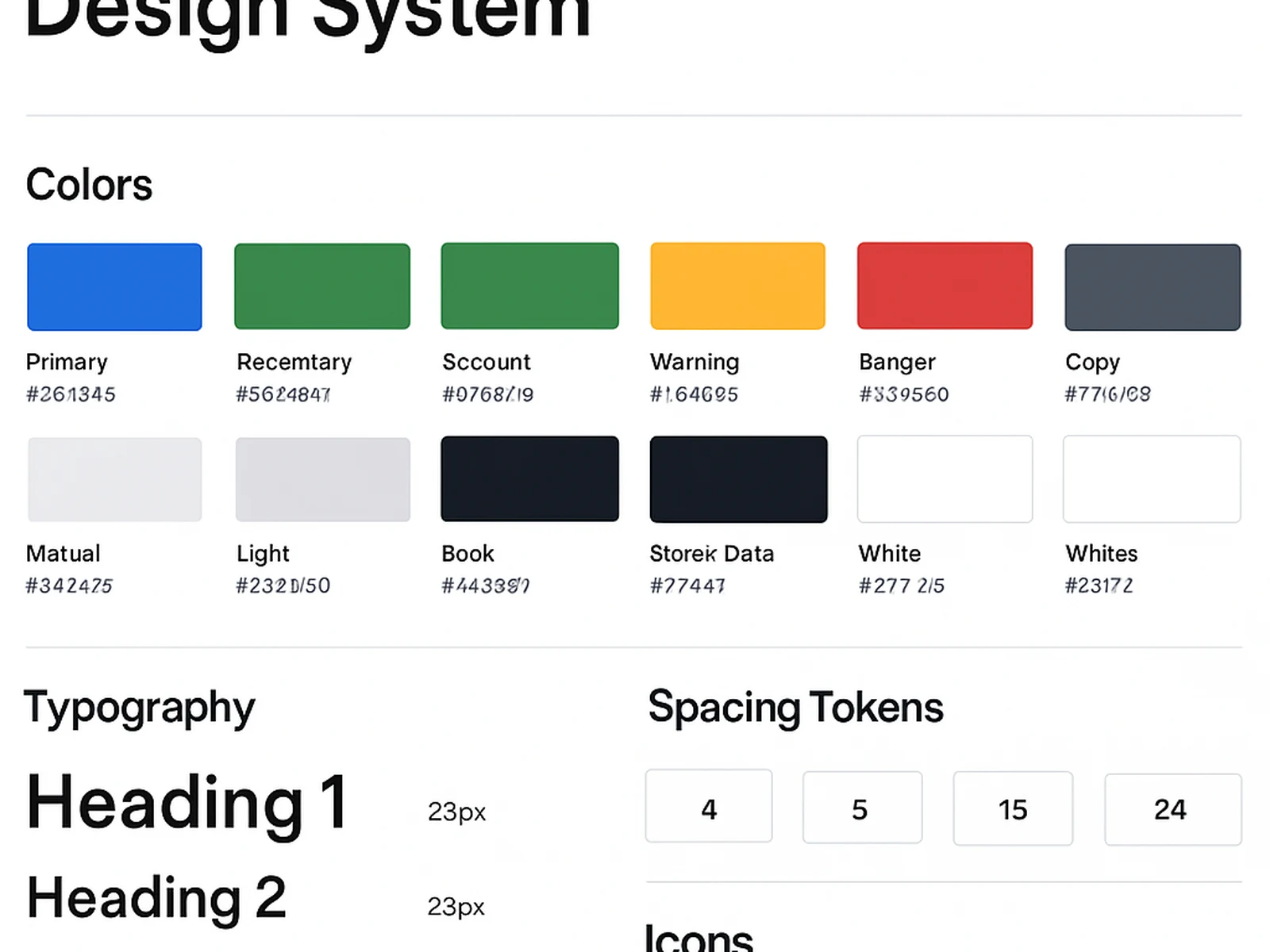
A UI Component Library is a single source of truth for every visual element in your product. It starts with the design tokens: colour, typography, spacing, elevation, and border radius. These feed into base components: buttons, inputs, checkboxes, toggles, dropdowns. These feed into compound components: form groups, cards, navigation patterns, modals, notifications. All are built in Figma with auto-layout, variant properties, and clear state coverage: default, hover, active, disabled, error.
Every component is documented with usage guidelines: when to use this component, when not to, what content constraints apply, and what accessibility considerations are built in. The documentation is designed for handover to a developer team and matches common naming conventions used in React, Vue, or similar component-based frameworks.
For Spanish software companies or product teams working across Spanish and international markets, the component library includes multi-language text handling considerations: minimum widths for labels that translate to longer Spanish or German text, for example.